PAINT | COLOUR GROUPS | An Architect Explains
Using colours in interiors can be tricky because there is the probability of things going horribly wrong. If not used well, then they can be jarring and irritating to the users. So colours have been classified into different groups to enable you to decide on the palette that you most identify with. As an Architect, I have explained the typical Colour groups under the following headings:
What are the typical colour groups?
Nurturing neutrals colour group
Intellectual colour group
Playful colour group
Healing colour group
Romantic colour group
WHAT ARE THE TYPICAL COLOUR GROUPS ?
Some colour groups make you want to get out of your chair, others make you want to settle down and read. Some colours are articulate and must be listened to. Others are very quiet. Some colour schemes indicate that you have travelled or are well read. Yet others create a desire for closeness, intimacy and love. Following are some of the most typical responses to various colour groups.
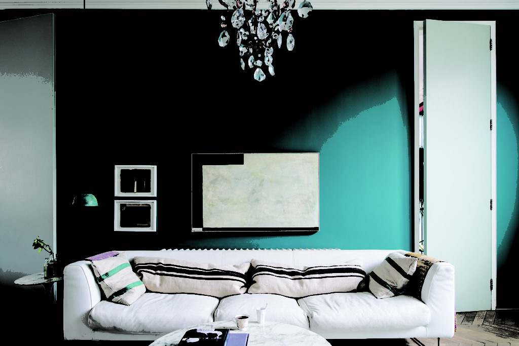
NURTURING NEURTALS COLOUR GROUP:
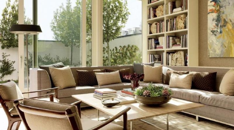
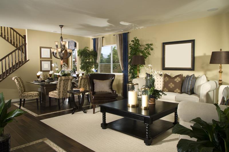
These colours create a sense of peace and well being. They foster quiet conversation with family and friends and can dispel loneliness. Throughout time, man has found a sense of peace and tranquility when in touch with “Mother Earth”. So, it follows that colours which impart a sense of warmth and serenity come directly from the Earth.
Colours in the Nurturing Neutrals Colour Group: In addition to the earth colours, are colours associated with the Sea such as sand, shell, coral, pearl, stone, seaweed. Green is a colour which helps us to adjust to new environments and situations, so it will always be found among the ‘nurturing neutrals’. Blues are also present in this group as the winter sky to stream to midnight. The ‘Nurturing neutrals’ are somewhat like the furniture while other palettes are more like accents or accessories.
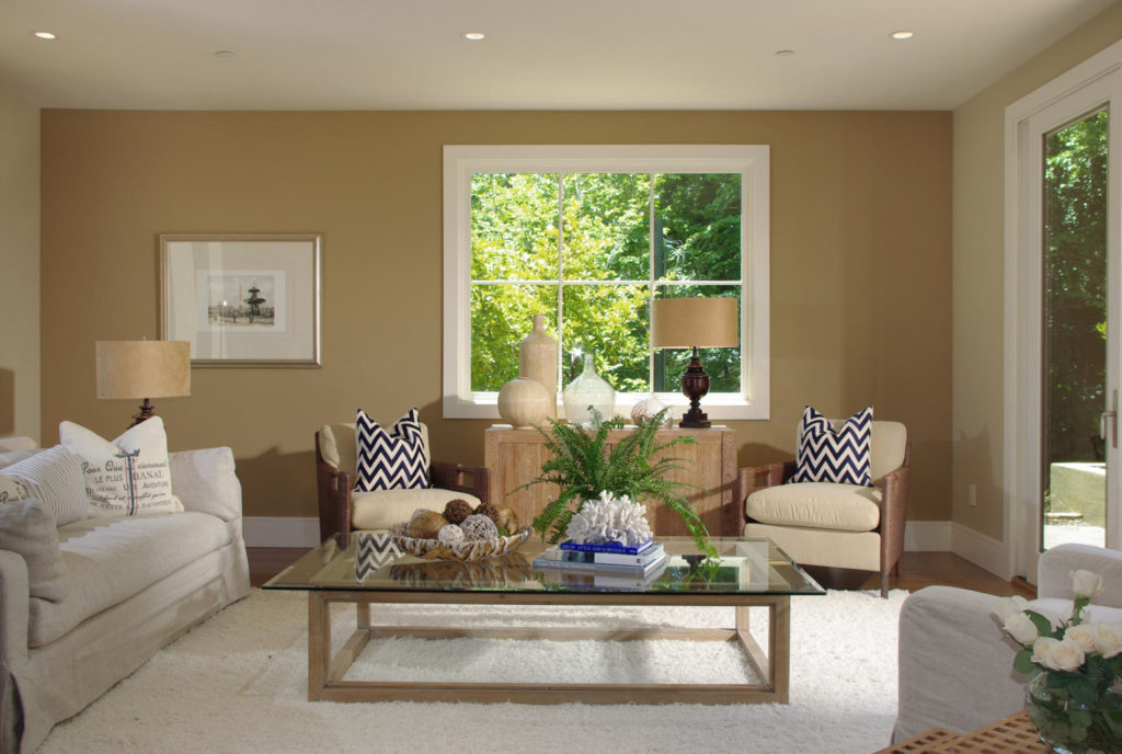
INTELLECTUAL COLOUR GROUP:
These are the sharp, witty and unique colours which convey a message that the owner has travelled, is well read and has something to say. These colours will command respect without being overbearing. This palette also starts with a earthy, warm base.
Colours in The Intellectual Colour Group: Grey is a colour which promotes creativity and will often be found in the foundation of an ‘intellectual palette’. However, these greys will be warm and gentle and not dull. Some tones of blue suggest communication and trust, so will naturally be found in the ‘intellectual palette’. Navy blues will often find their way in this palette, but its effect is warm and never cold. Red also appears in this ‘intellectual palette’, but the shades will be earthy and complicated like burgundy, cranberry etc.
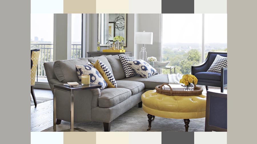
PLAYFUL COLOUR GROUP:
These colours are exiting and used for providing a fun environment. These playful, whimsical palettes create their own kind of music, like the sounds of children playing. There are highs and lows, lights and darks and always movement and activity. Used in active spaces within the home, a ‘playful palette’ can add energy and vitality. But if overdone, this type of palette becomes irritating and stressful.
Colours in The Playful Colour Group: The foundation of this palette is white . This could be anywhere from vanilla ice cream to snow drift to winter moon. Then comes the bubble gum pink, buttercup, wintergreen, all the berry colours and crayon colours. Many of these colours will be cool, and even in lighter tones there will be brightness and clarity. The bottom line in creating this type of palette is that the colours should suggest a sense of freedom, play and downright fun.
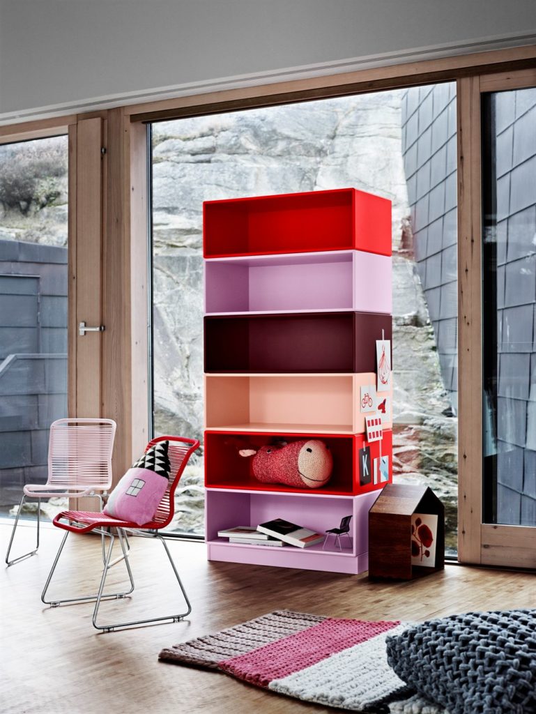
HEALING COLOUR GROUP:
This palette includes the colours which are very refreshing and rejuvenating. Like nurturing colours, ‘healing colours’ also begin by getting in touch with nature. So naturally the first group of colours considered in this palette are the greens because they have the power to help us adjust to new environments.
Colours in The Healing Colour Group: Skillful designers use lots of plants and other forms of green. Healing greens may be warm or cool, but never muddy or mysterious like those in the intellectual palette. Healing palettes also take inspiration from warm earth tones. These palettes usually contain contrast as well as a clarity of colour that is inspiring. They also include a range of lights and darks.
ROMANTIC COLOUR GROUP:
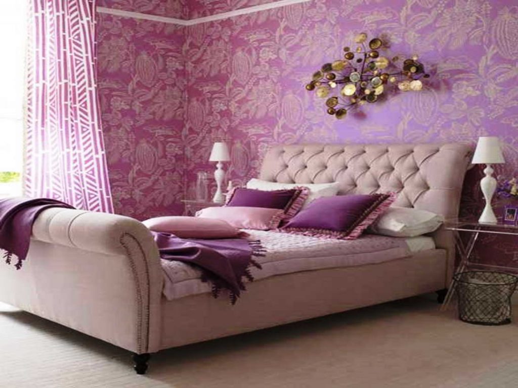
Many species including human beings attempt to attract the opposite sex with colours. Red is the colour of sex and lust and is often called the most romantic of colors. It is no accident that red is the chosen symbolic colour for Valentine’s Day. In interior design however, a less intense, softer tone of red is far more conducive to romance than the pure hue.
Colours in The Romantic Colour Group: Often referred as Pinks, these colours vary from cool to warm and from light to dark. Purple is another colour which is definitively romantic because of its passionate, unpredictable and quixotic characteristics. Paler, less intense tones of Orange such as apricot and peach are often included in the ‘romantic palette’, suggesting purity and innocence. Blues in the ‘romantic palette’ will be cool and inspired by water.
Even though this post explains the different colour groups, many people still find it difficult when choosing the colour sheme for their house. To help you, the some popular colour schemes have been explained here:
Related Topics:
- Paint Types
- Paint Glossary
- Paint Colours
- Paint Colour Wheel
- Paint Colour Themes
- Paint Effects of Colours
- An Architect’s Painting Guide
- Maintenance Of Painted Surfaces
- Common defects and remedies in painting
- Best Paint Brands In India
If you found this post useful, all it takes is a simple click on the “pin it” “like,” “share,” “tweet,” or Google+ buttons below the post.
