PAINT | COLOUR THEMES | An Architect Explains
The world is shrinking and cultures are melding. For once, Indians are laying aside their tried and tested formula for stylish interiors and are adopting international design concepts. The most visible change is in the use of colours. The modern Indian has started to experiment with fairly bold choices in colours. The wide variety in bright and bold paint colours is evidence of this shift. But whenever new ideas are tried out, there is the possibility that it can all go horribly wrong. So in order to avoid such a situation as an Architect, I have explained 5 contemporary colour schemes that look good in any interior. You can decide the scheme that you would like based on your and your family’s preferences:
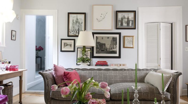
Classic colour theme
Minimalist colour theme
Organic colour theme
Dramatic colour theme
Eclectic colour theme
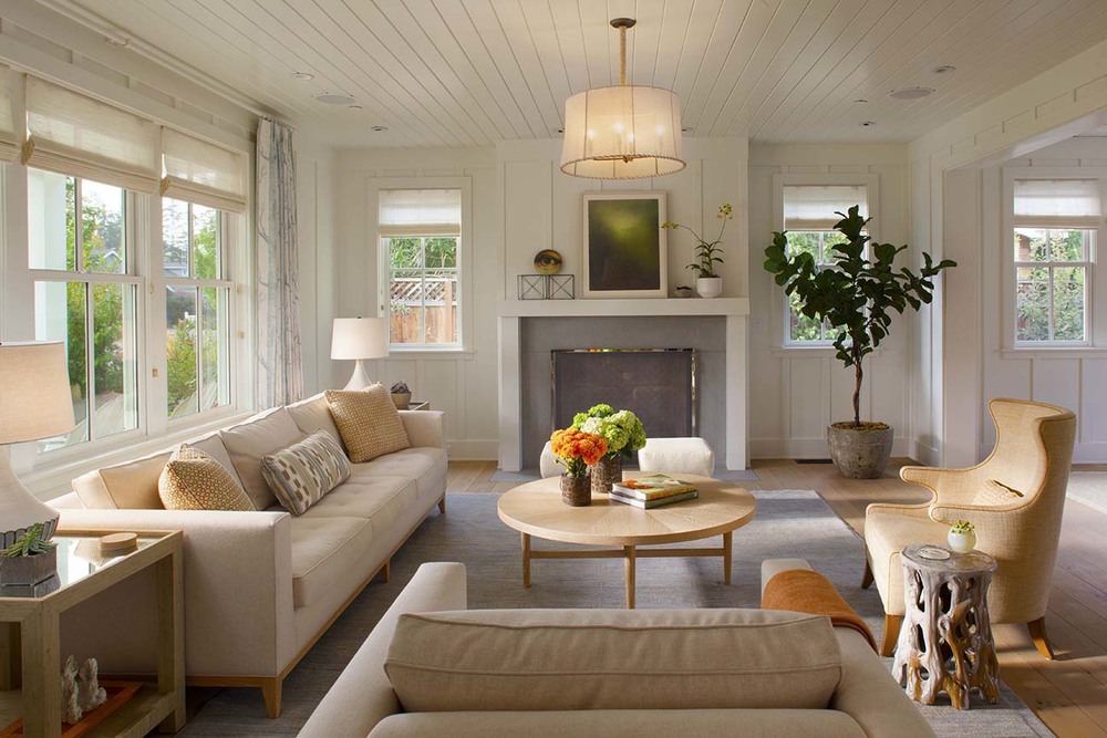
CLASSIC COLOUR THEME:
Definition: The Classical scheme has a gentle layering of shade variations and complementary accent colours that allow the eye to travel over the space without suffering from jarring breaks. The colours are sedate and elegant.
Colours:The most commonly used colours are classic pastels such as peach, pale blue, butter yellow, beige, caramel etc. As you can see, these shades are easy on the eye.
To achieve this effect: Make sure that while layering the base colour, the variations should not be more than two or three shades apart. So, the shift in the colour should be gradual and very subtle. Also, the accent colour added to the mix, should be very miniscule, so that it just registers as a contextual offset to the main colour, rather than as an overwhelming entity by itself.
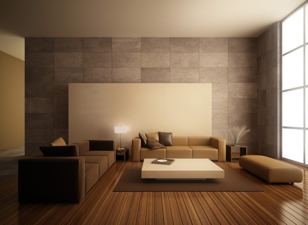
MINIMALIST COLOUR THEME:
Definition: As the name implies, in the Minimalist scheme, “less is more”. Like in the classical theme, minimalism is about subtle elegance. But the difference between the two schemes is that Classicism requires the colours to blend agreeably, to whisper out, while in the minimalist scheme, a balance of contrasts is used to make a strident statement.
Colours:Usually this is a one-two combination scheme with no more than two colours used in one space. Typically the base colour that covers the vast expanse of the space is a neutral shade like white, beige, pewter or charcoal. The same colour may also run in the furniture and flooring to prevent visual breaks. To finish, shocks of a second, brighter, stronger and contrasting shade are distributed around the room in small doses.
To achieve this effect: When deciding the colours and their placement, you should have a fine sense of balance. The accent colour is the key – if it is overdone, then the room might look cluttered and if underdone, the room may look featureless and uninteresting.
ORGANIC COLOUR THEME:
Definition: Lately, organic schemes have become very popular, probably due to the trend for ‘green’ designs. This scheme is characterized by hues typical of nature and the elements. It could be a tropical rainforest theme or a balmy beachfront kind of theme.
Colours: The best thing about this scheme is that the colours are already laid out for you. Popular choices are sand, eggshell, wheat, sea green, ultramarine blue, ochre, olive green, rust etc. You can also use materials from nature itself, like organic fibres, natural untreated wood, plants and flowers.
To achieve this effect: You need to decide your choice of natural vista. There is no restriction on the number of colours you can use in this scheme. The only watchword is moderation – don’t forget that this is supposed to be a sensory representation and not a literal one.
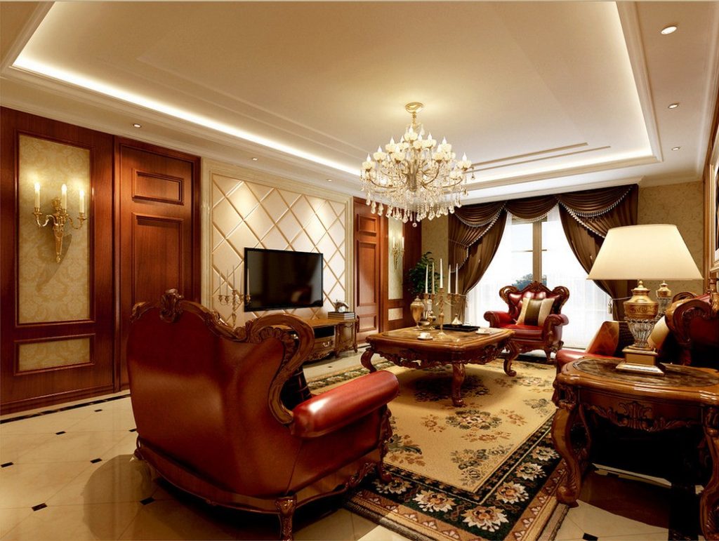
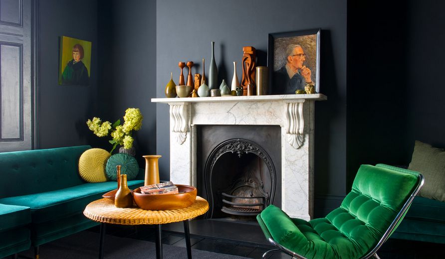
DRAMATIC COLOUR THEME:
Definition: This scheme is for those who like to live large. In this style, there is no restraint- it is about pulling out all stops. In fact the bolder your choice, the better it is. The individual colour choices you make will decide whether your space looks plush or elegant or hip or sexy. Rich colours, luxurious accents and strong shade contrasts work well in this theme.
Colours: Deep burgundy, royal purple, teal, chocolate, olive and midnight blue, often laced with gold and other metallic shades are the most common choices in the dramatic theme.
To achieve this effect: You can use more than three colour combinations, provided there is an attractive balance of elements. Your main shade should be the strongest and cover 65-70% of the room. The primary accent should cover 20% and in the remaining areas, you can use your secondary and tertiary accents in varying degrees. While this theme allows you to take more risks and be bolder, there is the possibility of your space becoming gaudy instead of glamorous.
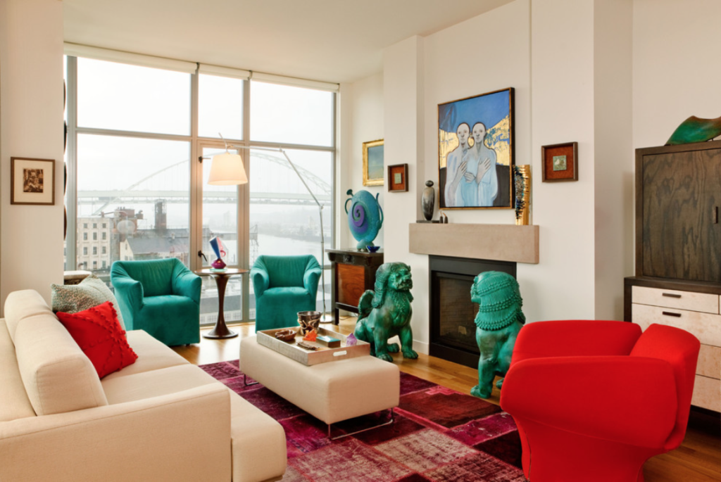
ECLECTIC COLOUR THEME:
Definition: Individualism is the keyword in this scheme. It is all about personal voice and vision. The idea is to create a space that is whimsical, unusual, tasteful and completely you. Therefore, it can be most fun doing this theme and also the most forgiving. There are no set rules for this theme and the number of colour juxtapositions are limitless and as varied as the number of people on earth! This is a good theme to choose if you can’t settle on just one or two colours.
Colours: In this theme, you do not need to designate a particular colour set. You can keep the space fairly basic and then let the colour flow through various accessories.
To achieve this effect: It is best attempted, only if you are conversant with colour and confident of your choices. A lack of vision and conviction can make the space look confusing an jarring. Of course, the advantage of this theme is that you can always say that, it was the effect you wanted. Only, don’t expect the others to agree with you!
Hopefully, this round up of colour schemes will help you in deciding the colours of your house. Have fun while putting your theme together. It may seem like a risky experiment, but remember that you need to please yourself first and don’t worry about what others think. Then usually, it will come out right.
On the other hand, if it is Colour groups that you want to know about, then go to:
In order to execute the colours of your choice in your house, you have a wide variety to choose from. For information on some of the best paints in India, go to:
Related Topics:
- Paint Types
- Paint Glossary
- Paint Colours
- Paint Colour Wheel
- Paint Colour Groups
- Paint Effects of Colours
- An Architect’s Painting Guide
- Maintenance Of Painted Surfaces
- Common defects and remedies in painting
- Best Paint Brands In India
If you found this post useful, all it takes is a simple click on the “pin it” “like,” “share,” “tweet,” or Google+ buttons below the post.

